VivaColombia Airline
Re-brand of VivaColombia.
Problem: VivaColombia uses a very childish bubble shaped logo that does not make the airline look legitimate or safe. Their brand and logo is also very inconsistent throughout social media and mainly their website. VivaColombia wants to be seen as a serious competitor to current Columbian airlines.
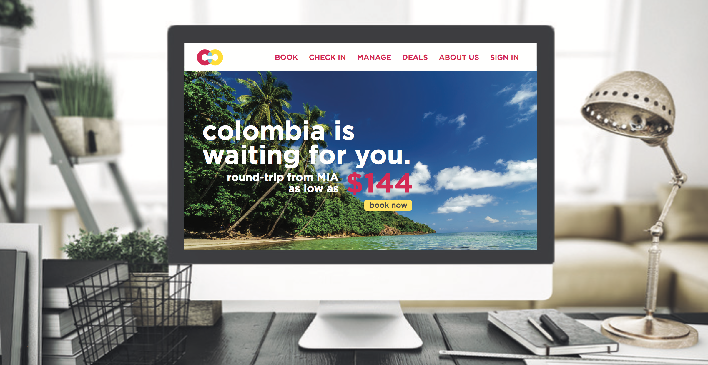
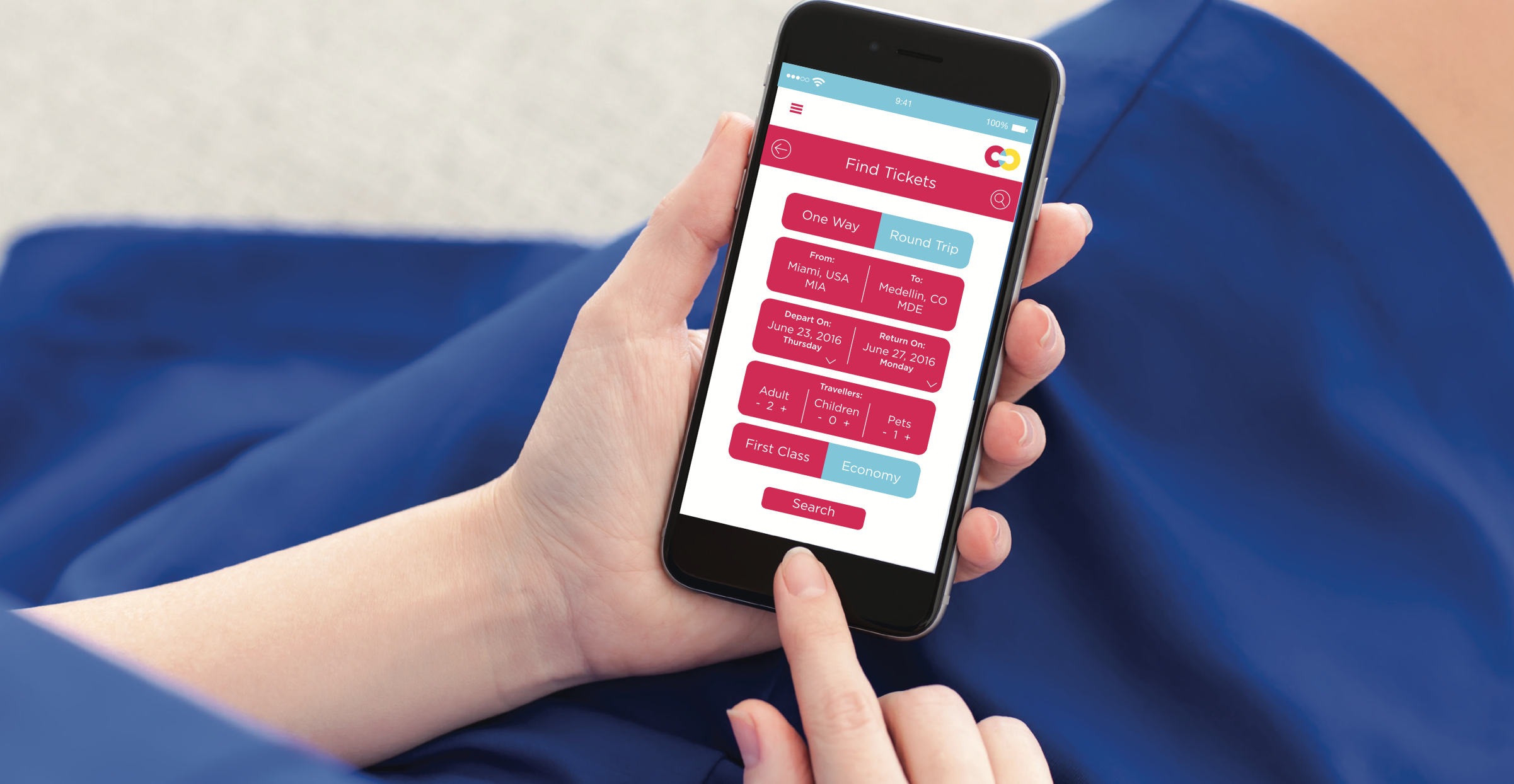
Goal: Create a logo that will capture the vibrant spirit of Colombia, yet earn customers' trust to fly. Compose a style guide that reflects the brand's personality and puts VivaColombia in the spotlight.
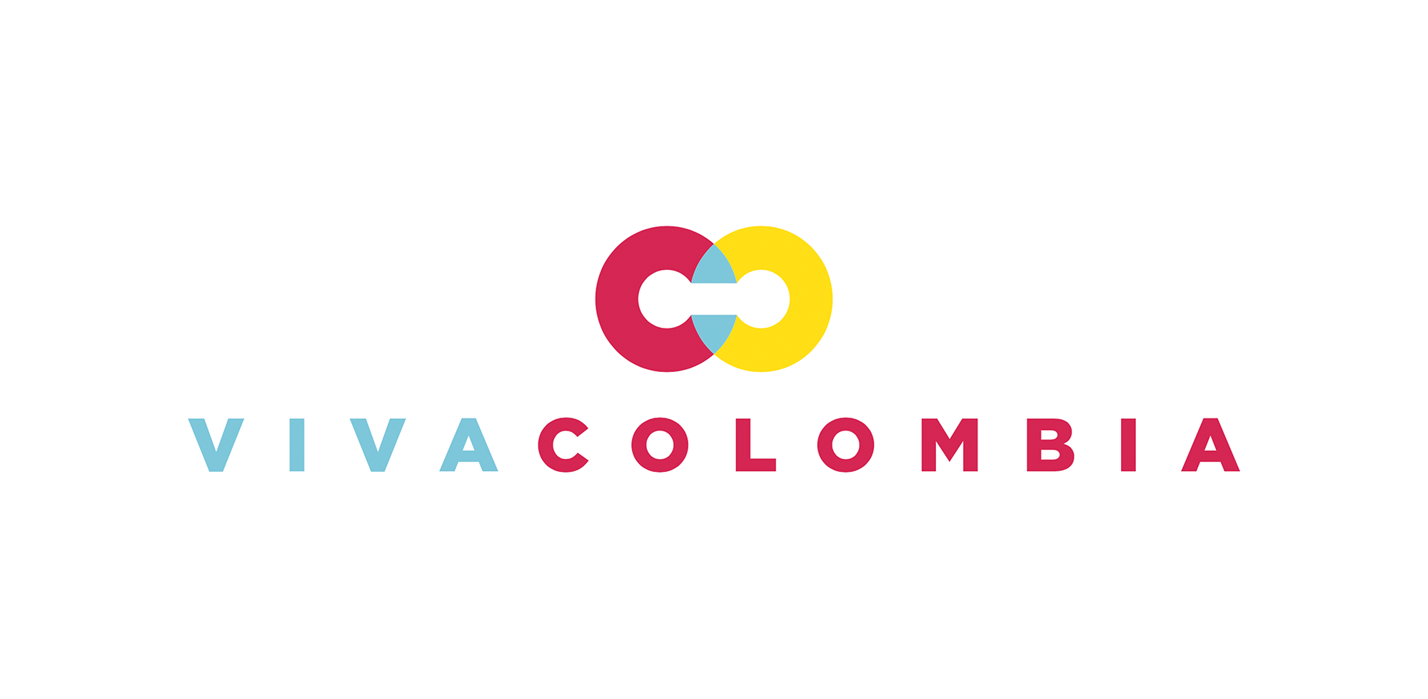
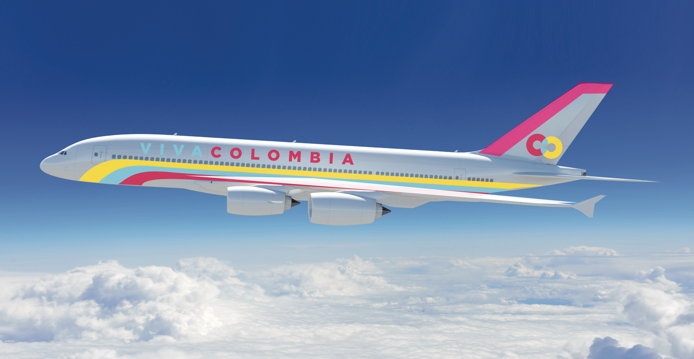
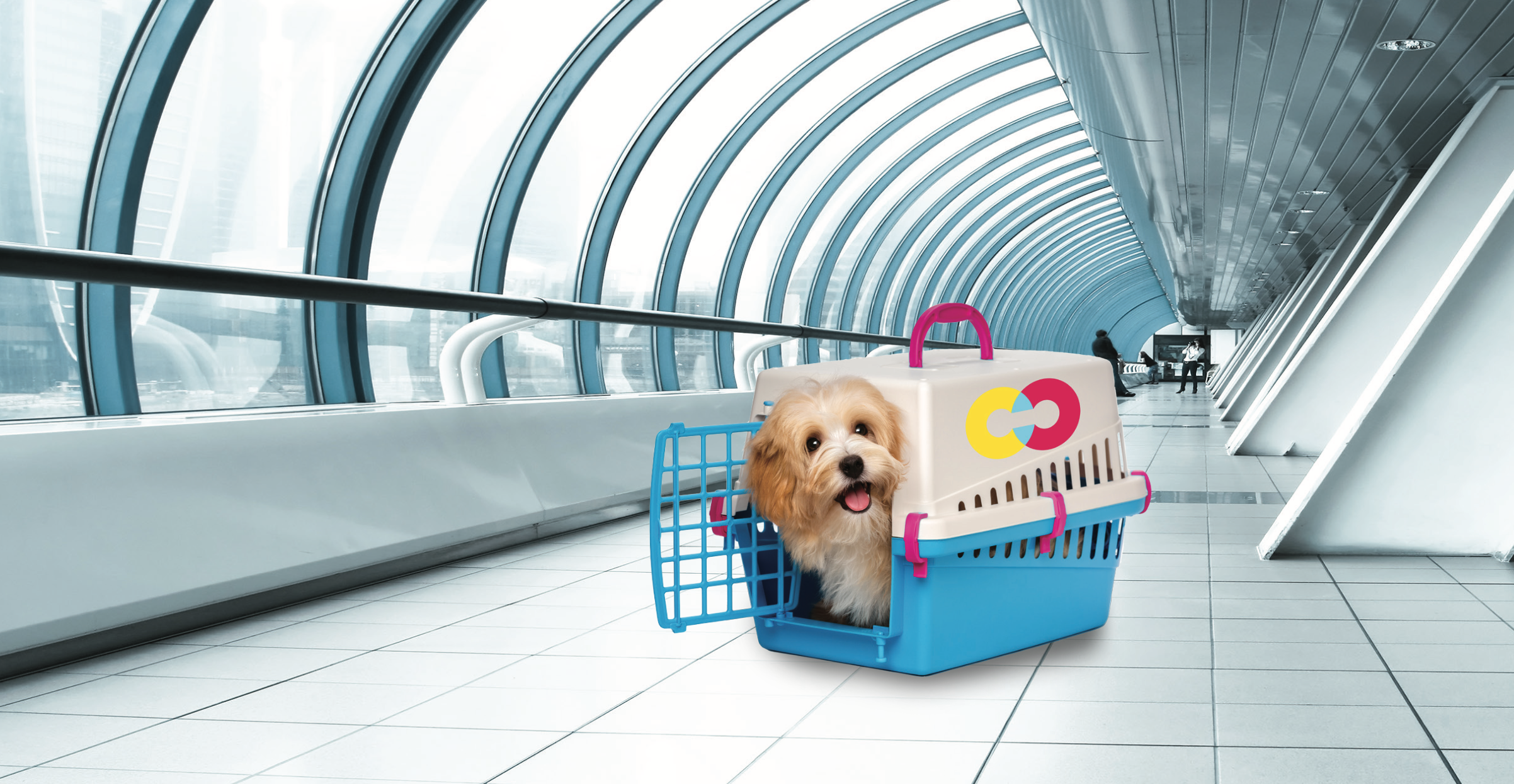
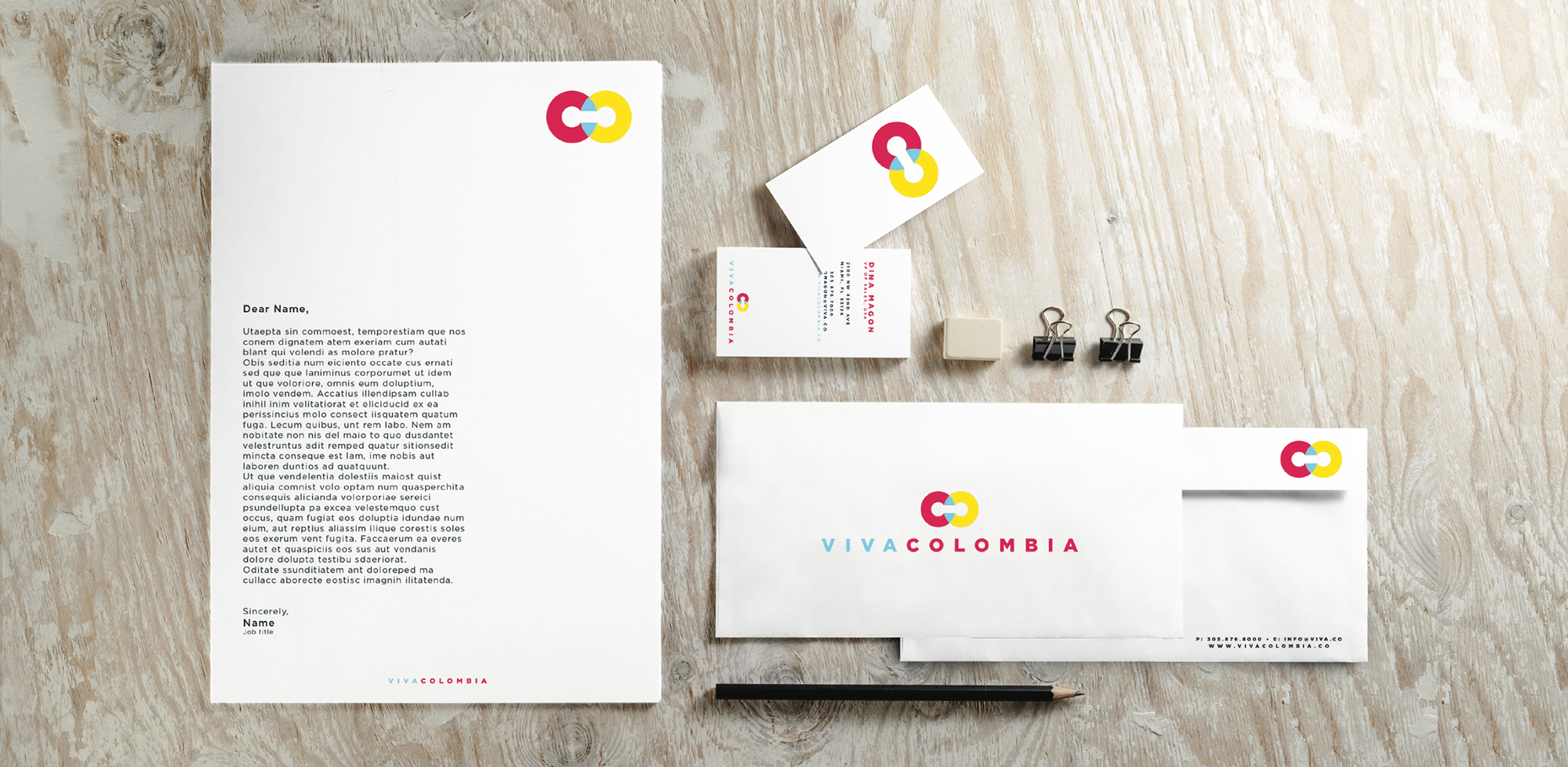
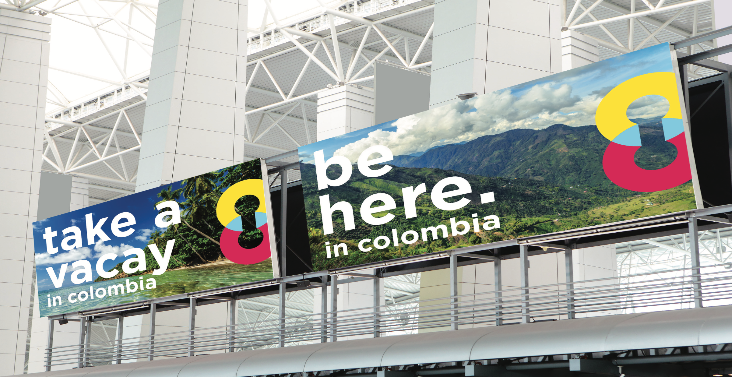
Solution: For the logo, I decided to focus on the 'Co' in Colombia, as both of these letters are circular but not identical, they signify the international code for Colombia, and they are the country's web address ending. The negative space in CO symbolizes traveling - "From point A to point B." Knowing through research how deeply rooted in color, pattern and the Colombian flag the culture of Colombia is, I knew right away that I had to incorporate that into the logo. Even though the colors are updated, they carry on the traditions... the blue triangles where CO cross over, symbolize the many patterns in Colombia, and mainly the togetherness of Colombian people throughout the tough times the country has faced.
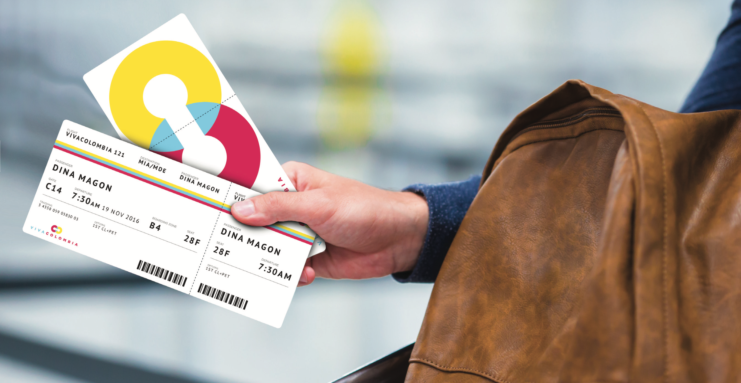
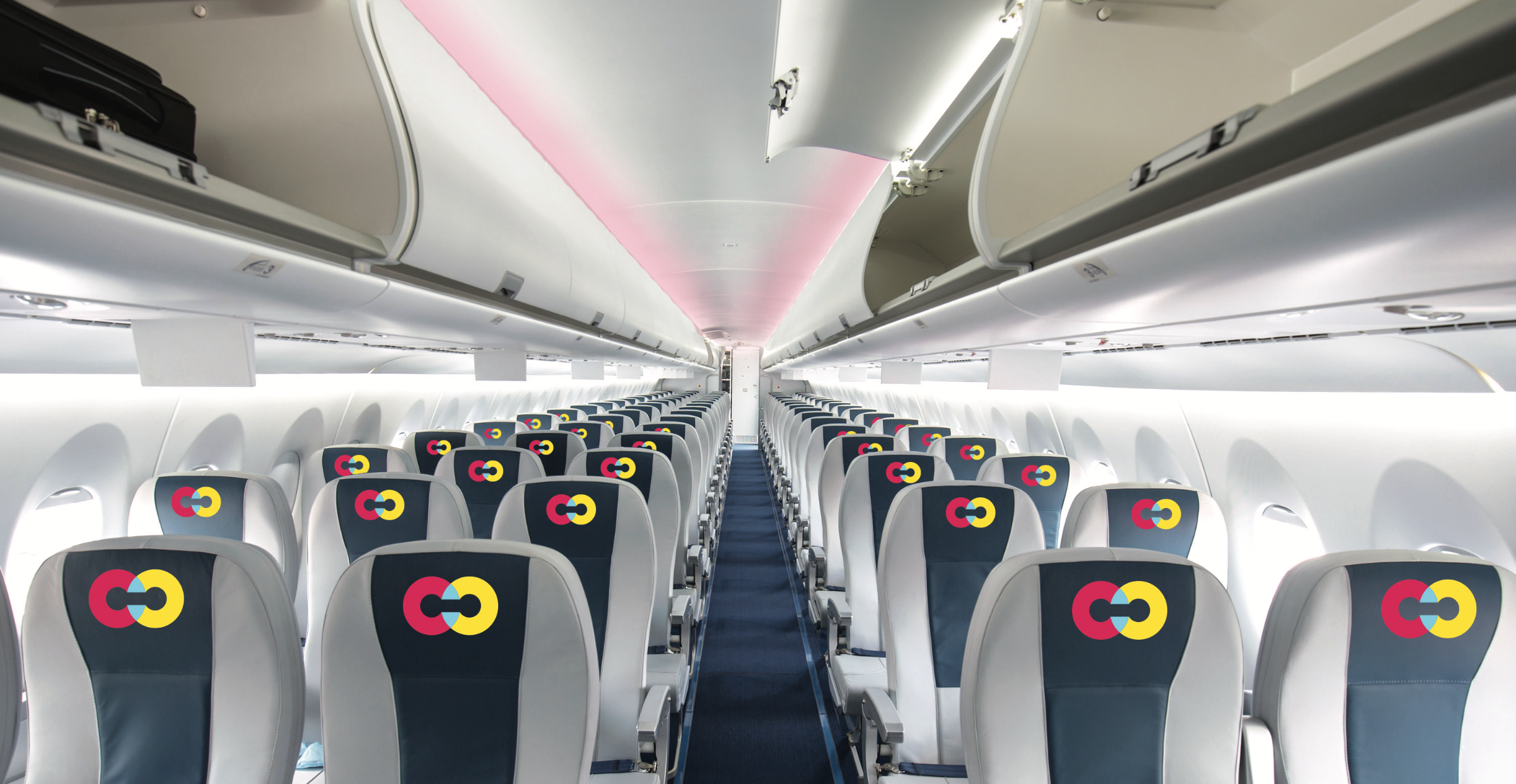
For the rest of the collateral, I decided to stay simple and use a good amount of white space, to let the text have room to breathe... or fly...
// Programs used: Adobe Ai, Id + Ps